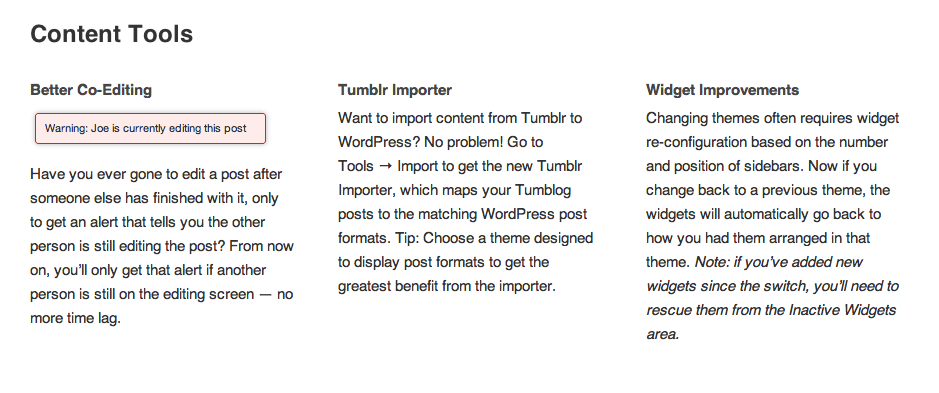
Making Background Images Play Nicely With iOS
I was testing my site on my iPhone, and my header was…not pretty.

I was using media queries and everything, but it was showing up all blown up and blurry.
@media only screen and (max-width: 800px) {
.site-header {
background-image:url(images/laptop-mobile.jpg);
background-position: fixed no-repeat center center;
background-position: fixed no-repeat center center;
-moz-background-position: fixed no-repeat center center;
-webkit-background-position: fixed no-repeat center center;
-o-background-position: fixed no-repeat center center;
-webkit-background-size:cover;
-moz-background-size:cover;
-o-background-size:cover;
background-size:cover;
}
}
Super annoying.
The Internet told me that iOS (at least in previous versions) has had a problem with
position: fixed;
Okay. That’s fine, since it wasn’t parallaxing (that’s totally a word) on mobile anyway.
But getting rid of
position: fixed;
didn’t fix it. Why. Why? INTERNET. YOU ARE NOT COMING THROUGH.
So then I basically started trying every suggestion Google could throw at me, until – bliss! – this post on BrainHappy solved all my problems.

Here’s my fix, modified slightly from the original:
.site-header {
background-image:url(images/laptop-mobile.jpg);
background-repeat: no-repeat;
background-attachment: scroll;
background-position: center;
-webkit-background-size: cover;
-moz-background-size: cover;
background-size: cover;
-o-background-size: cover;
min-height: 125px;
}
Yay! The Internet came through after all.
Also: waffles.